
Client Name
Urban Bloom Initiative Committee
Credit
Visual Identity, Logo Design, Environmental Graphic Design, Print Campaign Mockups: Aprar design
Project
An urban revitalization initiative branding and promotional campaign designed to foster community connections through green spaces and public engagement in city environments.
Request
Establish a complete visual identity and campaign system for the "Urban Bloom Initiative" public workshop and exhibition.
Create a symbolic mark and design system that transitions smoothly across physical print touchpoints, environmental signage, and branded collateral while conveying community warmth and environmental growth.
Design Concept


Logo Design & Symbolic Rationale
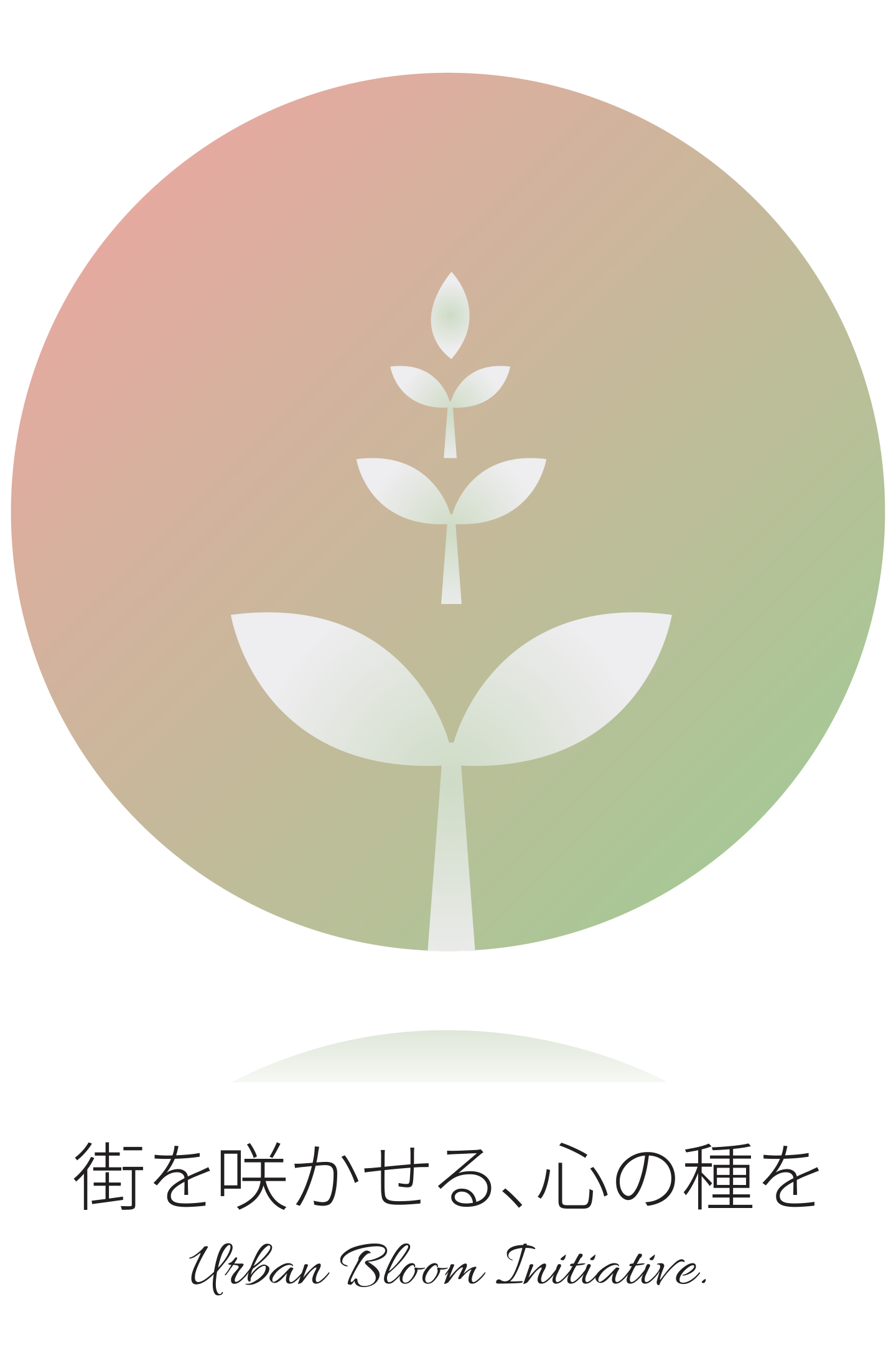
The identity centres around a circular emblem containing upward-growing sprout motifs that transition from small nodes to full leaves, symbolizing community nurture and incremental urban growth:
Natural Gradient Palette: Soft transitions from terracotta/warm coral to organic sage green evoke natural bloom, vitality, and human warmth within an urban setting.
Sprout & Growth Symbolism: The central vertical sprout hierarchy illustrates progression—planting seeds in daily life that flourish into broader community connections.
Geometric Balance: A perfect circular enclosure grounds the mark, making it highly versatile for small-scale applications like pins or stationery seals as well as large-scale environmental displays.
Visual Architecture & Touchpoint Integration
The design system ensures seamless scalability across diverse real-world contexts:
OOH & Environmental Signage: The high-contrast logo and clean layout provide clear visibility in busy public spaces, such as transit station pillars and overhead hanging banners.
Print Collateral & Merchandising: The soft color palette translates effortlessly onto physical media, including organic cotton tote bags, envelopes, flyers, and event programs.
Typography & Information Hierarchy
Primary Slogan: Japanese typography paired with elegant script ("街を咲かせる、心の種を") highlights the human-centric narrative of the initiative.
Structured Event Footers: Event dates, venue location (Green Space Hall), and workshop details are organized with clear numerical priority, ensuring key logistical information is instantly readable from a distance.
Client Name
Urban Bloom Initiative Committee
Credit
Visual Identity, Logo Design, Environmental Graphic Design, Print Campaign Mockups: Aprar design
Project
An urban revitalization initiative branding and promotional campaign designed to foster community connections through green spaces and public engagement in city environments.
Request
Establish a complete visual identity and campaign system for the "Urban Bloom Initiative" public workshop and exhibition.
Create a symbolic mark and design system that transitions smoothly across physical print touchpoints, environmental signage, and branded collateral while conveying community warmth and environmental growth.
Design Concept
Logo Design & Symbolic Rationale
The identity centres around a circular emblem containing upward-growing sprout motifs that transition from small nodes to full leaves, symbolizing community nurture and incremental urban growth:
Natural Gradient Palette: Soft transitions from terracotta/warm coral to organic sage green evoke natural bloom, vitality, and human warmth within an urban setting.
Sprout & Growth Symbolism: The central vertical sprout hierarchy illustrates progression—planting seeds in daily life that flourish into broader community connections.
Geometric Balance: A perfect circular enclosure grounds the mark, making it highly versatile for small-scale applications like pins or stationery seals as well as large-scale environmental displays.
Visual Architecture & Touchpoint Integration
The design system ensures seamless scalability across diverse real-world contexts:
OOH & Environmental Signage: The high-contrast logo and clean layout provide clear visibility in busy public spaces, such as transit station pillars and overhead hanging banners.
Print Collateral & Merchandising: The soft color palette translates effortlessly onto physical media, including organic cotton tote bags, envelopes, flyers, and event programs.
Typography & Information Hierarchy
Primary Slogan: Japanese typography paired with elegant script ("街を咲かせる、心の種を") highlights the human-centric narrative of the initiative.
Structured Event Footers: Event dates, venue location (Green Space Hall), and workshop details are organized with clear numerical priority, ensuring key logistical information is instantly readable from a distance.
Urban Bloom Initiative 2027 — Visual Identity & Campaign Design System
Illustration, Branding, Graphic Design
2026
Brand & Graphic Designer
Urban Bloom Initiative 2027 — Visual Identity & Campaign Design System
Illustration, Branding, Graphic Design
2026
Brand & Graphic Designer
Aprar design