Murasaki Studio — Japanese Fashion Branding Concepts & Custom Manga Illustration
Illustration, Graphic Design
2026
Designer & Illustrator




Murasaki Studio
Credit
Brand Identity, Custom Manga Illustration & E-Commerce Web Layout: Aprar design
Project
An editorial e-commerce landing page design fusing contemporary fashion photography with bespoke, hand-drawn manga vector art.
Request
Create a sophisticated, localized fashion lookbook identity targeting Japanese youth streetwear culture.
Design custom, high-fidelity manga character illustrations that mirror the exact poses and wardrobe choices of the editorial photography.
Formulate a dynamic, angular grid layout for web environments that seamlessly weaves photographic reality with graphic ink illustration.
Produce interactive lookbook modules containing item price structures and clear digital navigation actions.
Design Concept
Manga-Photography Fusion & Character Cohesion
The core foundation of the Murasaki Studio brand system is an intimate visual dialogue between photographic portraits and stylized vector graphics:
Mirror Image Manga Style: Rather than using generic decorative drawings, custom manga illustrations were crafted to duplicate the model's exact physical posture, emotional expression, and styling. This creates a cohesive narrative flow where ink and photography exist as alternative realities of the same fashion pieces.
Dynamic Angular Geometry: The website interface breaks away from traditional square grids, utilizing sharp, diagonal slashes to bifurcate layout sections. These interlocking geometric panels split focus perfectly between realistic editorial environments and bold monochrome character frames.
Editorial Web Architecture & Lookbook Components
The e-commerce user interface is optimized to behave like a premium lifestyle magazine while maintaining straightforward digital shopping paths:
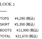
Integrated E-Commerce Lookbooks: Each lookbook tier displays a clear, structural pricing layout ("T-Shirt", "Shorts", "Total") paired with delicate, circular check actions. This ensures that the dense, artistic illustrations remain directly tethered to a functional retail system.
Minimalist Brand Storyboards: The "Brand Story" block leverages expansive white space, pairing a crisp, left-aligned manga portrait with delicate sakura branch vector iconography. This provides an elegant, breathable reading layout that communicates a thoughtful, poetic narrative before introducing product lists.
Brand Colour Palette
The color architecture utilizes deep, regal Japanese hues paired with soft, romantic pastels to reflect an upscale, independent street fashion identity:
Murasaki Dark Purple (#251E2B): The heavy brand anchor, providing rich, high-contrast solid backgrounds and deep typographic boundaries.
Wisteria Lavender (#D7CBE3): Implemented across the diagonal graphic frames to separate flat background ink vectors from realistic environmental tones.
Off-White Base (#FAF8F5): Softens the digital reading experience, giving the entire e-commerce portal the texture of a high-end matte paper fashion lookbook.
Design Execution & Scalability
This case study demonstrates the seamless integration of professional retail layout frameworks with premium, customised graphic illustrations. By moving beyond stock decorative assets and formulating a responsive, content-first layout system, the workflow successfully transforms a traditional apparel collection into an immersive, multi-disciplinary digital experience.
The entire web template is engineered with absolute vector precision to guarantee responsive layout scalability. The sharp diagonal boundary panels and custom fine ink strokes maintain flawless alignment metrics across wide desktop landing views, while the modular look book components, balanced vertical typography, and product card clusters retain total readability and navigation ease on compact mobile viewports.