


Client Name
Nagasaki Bayside Festival Committee
Credit
Brand Identity, Custom Manga Illustration, Print Campaign & Out-of-Home Mockups: Aprar design
Project
A seasonal festival promotional campaign fusing retro Japanese anime/manga illustration aesthetics with modern layout design across print flyers, posters, and physical transit signage.
Request
Create a cohesive, four-part visual campaign targeting visitors for the Floral Festival at Nagasaki Seaside Park.
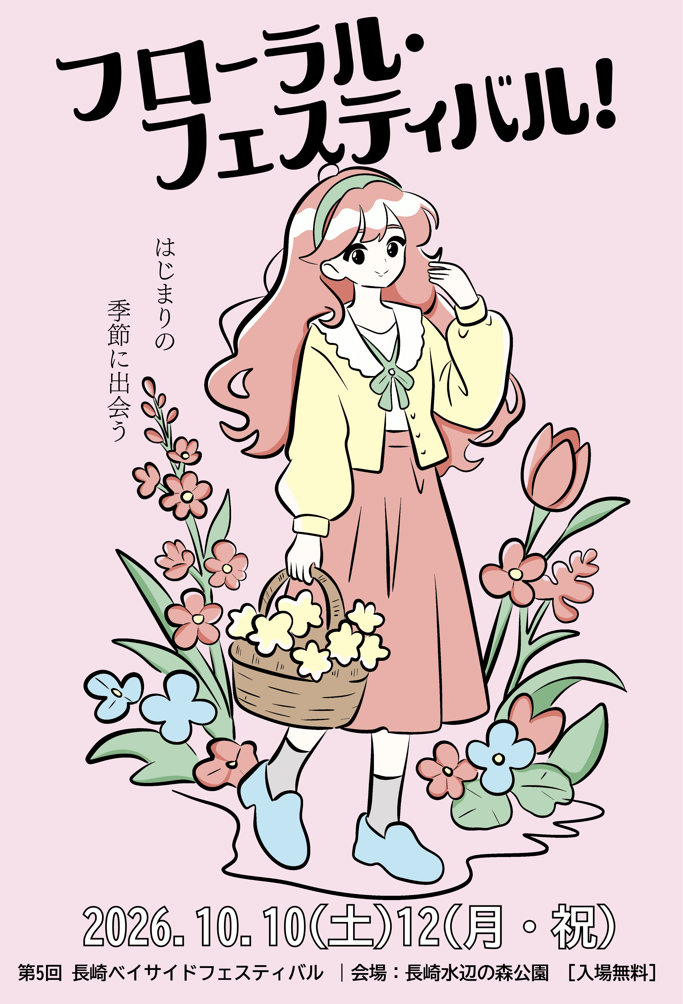
Design custom retro-inspired manga character illustrations in Adobe Illustrator, with each character representing a distinct floral colorway and seasonal vibe.
Establish a versatile design system that scales seamlessly across individual promotional flyers, multi-poster mockups, and large-format outdoor transit signage.
Maintain clear typographic hierarchy for Japanese script (title, slogan, event dates, venue details) across all physical and digital touchpoints.
Design Concept


Campaign Architecture & Touchpoint Integration
The design layout is built to capture public attention across physical urban environments and high-traffic event touchpoints:
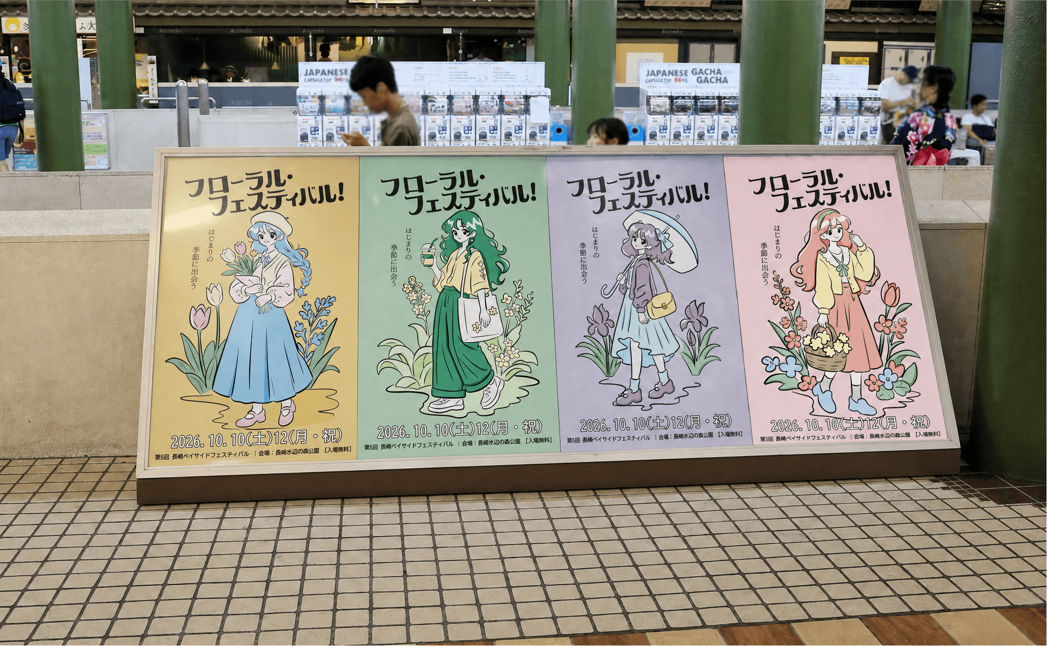
Multi-Asset Campaign Hierarchy: The project spans four distinct visual variants designed to work both as a unified 4-panel billboard exhibition and as standalone promotional flyers/posters.
OOH & Environmental Mockups: Validated the visual impact of the design across real-world physical applications, including printed flyer stacks and large-format station concourse displays.
Retro Manga Illustration & Character Cohesion
The visual core relies on nostalgia-driven, 80s/90s-style manga illustration paired with soft, seasonal color palettes:
Character-Driven Narrative: Designed four unique female characters—each styled in contemporary street fashion, carrying flowers or seasonal drinks—to create an engaging, relatable narrative flow for festival attendees.
Line Art & Pastel Harmony: Balanced crisp vector line art with soft background pastels (cream yellow, sage green, lavender, and dusty rose) to mirror the organic feel of spring and summer blooms.
Typography & Information System
The typographic layout ensures high legibility while complementing the playful, expressive art style:
Dynamic Title Typography: Custom bold Japanese lettering (フローラル・フェスティバル!) serves as an energetic visual anchor at the top of each poster.
Structured Event Footers: Organised key logistics—dates, location (Nagasaki Seaside Park), and admission info—into a clean, grounded footer band that maintains readability from a distance.
Design Execution & Scalability
This case study demonstrates the seamless application of custom vector artwork into full-scale promotional campaigns. By structuring the illustrations into a flexible 4-part modular system, the identity scales effortlessly across diverse physical media while preserving brand identity and visual harmony.
Client Name
Nagasaki Bayside Festival Committee
Credit
Brand Identity, Custom Manga Illustration, Print Campaign & Out-of-Home Mockups: Aprar design
Project
A seasonal festival promotional campaign fusing retro Japanese anime/manga illustration aesthetics with modern layout design across print flyers, posters, and physical transit signage.
Request
Create a cohesive, four-part visual campaign targeting visitors for the Floral Festival at Nagasaki Seaside Park.
Design custom retro-inspired manga character illustrations in Adobe Illustrator, with each character representing a distinct floral colorway and seasonal vibe.
Establish a versatile design system that scales seamlessly across individual promotional flyers, multi-poster mockups, and large-format outdoor transit signage.
Maintain clear typographic hierarchy for Japanese script (title, slogan, event dates, venue details) across all physical and digital touchpoints.
Design Concept
Campaign Architecture & Touchpoint Integration
The design layout is built to capture public attention across physical urban environments and high-traffic event touchpoints:
Multi-Asset Campaign Hierarchy: The project spans four distinct visual variants designed to work both as a unified 4-panel billboard exhibition and as standalone promotional flyers/posters.
OOH & Environmental Mockups: Validated the visual impact of the design across real-world physical applications, including printed flyer stacks and large-format station concourse displays.
Retro Manga Illustration & Character Cohesion
The visual core relies on nostalgia-driven, 80s/90s-style manga illustration paired with soft, seasonal color palettes:
Character-Driven Narrative: Designed four unique female characters—each styled in contemporary street fashion, carrying flowers or seasonal drinks—to create an engaging, relatable narrative flow for festival attendees.
Line Art & Pastel Harmony: Balanced crisp vector line art with soft background pastels (cream yellow, sage green, lavender, and dusty rose) to mirror the organic feel of spring and summer blooms.
Typography & Information System
The typographic layout ensures high legibility while complementing the playful, expressive art style:
Dynamic Title Typography: Custom bold Japanese lettering (フローラル・フェスティバル!) serves as an energetic visual anchor at the top of each poster.
Structured Event Footers: Organised key logistics—dates, location (Nagasaki Seaside Park), and admission info—into a clean, grounded footer band that maintains readability from a distance.
Design Execution & Scalability
This case study demonstrates the seamless application of custom vector artwork into full-scale promotional campaigns. By structuring the illustrations into a flexible 4-part modular system, the identity scales effortlessly across diverse physical media while preserving brand identity and visual harmony.
Floral Festival — Seasonal Campaign Branding & Manga Illustration
Illustration, Branding, Graphic Design
2026
Designer & Illustrator
Floral Festival — Seasonal Campaign Branding & Manga Illustration
Illustration, Branding, Graphic Design
2025
Designer & Illustrator
Aprar design